
If you’ve ever struggled to cram your bicycle into a crowded subway—or watched someone try to do it—you know the potential hazards of trying to mix biking with rail travel. The staff at Los Angeles County Metropolitan Transportation Authority (aka Metro) are all too familiar with that challenge. So they decided to start creating bike hubs at every Metro station, giving commuters places to securely store their bicycles before hopping onto the train each morning, as well as gain access to other bike-related amenities and services. ARG has recently designed one of Metro’s bike hubs at historic Union Station, built in 1939 and listed on the National Register of Historic Places. The challenge was to fit all the program needs into a tight site while making sure the hub would read as contemporary—yet compatible with the historic station.
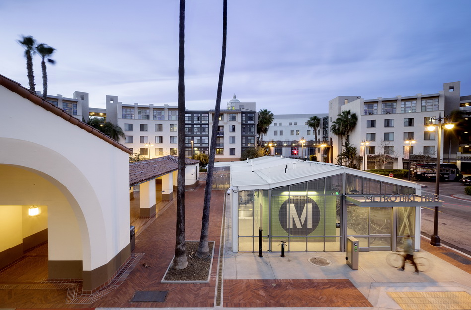
The new, standalone bike hub is sited in a former parking lot next to the north breezeway of Union Station West, near Alameda Street. There was a very small footprint to work with, constrained by existing streets, buildings, and landscape features. The facility needed to accommodate parking for about two hundred bicycles, an ADA accessible unisex restroom, a water bottle filling station, a bike fix-it station, and a bike retail/repair shop for a third-party retailer to sell bikes and accessories, offer repair services, and provide classes and tours. The bike retail space needed to be securely closed off from the storage and exterior space, while also having its own access points. All this, along with a controlled entry system (the hub is open 24/7).
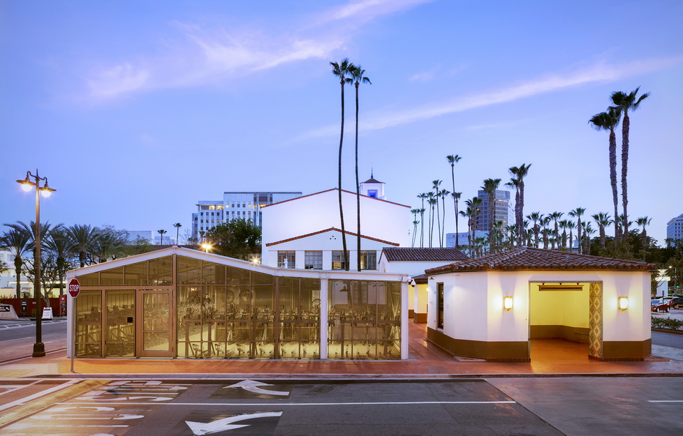
Our design for the Union Station Bike Hub was inspired and informed by many elements and ideas. Most importantly, we wanted to make sure we referenced the historic Union Station terminal in the design of this new bike hub structure. We used the siting of the new structure to inform the massing and form of the building. The roof ridge and eaves of the bike hub correspond directly to the adjacent historic breezeway; the solid and voids created by the breezeway inform the location of solid standing seam siding and the open-air perforated metal panels. We also referenced the overall planning of the historic station, regarding the numerous outdoor courtyard spaces that are formed by the built structures. Therefore, we located the building on the site in a way to create a new courtyard space between the historic breezeway and the new bike hub. We also selected a color scheme for the exterior of the building that blends in closely with the existing historic building.
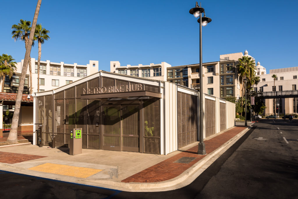
In addition, we looked towards the history of train-shed architecture and were inspired by the open-air exposed iron structure buildings that were typically constructed in the early 20th century. We took that influence and made the structural system of the bike hub a focal point by leaving the steel members exposed. We also determined that being a bike shed, this building did not need to be conditioned and watertight. Instead, we designed the building to be open to the elements with perforated metal panels as a portion of the skin of the building. These perforated panels would allow for natural cross-ventilation of the building, to help keep the building cool in the summer months without the use of a mechanical cooling system.
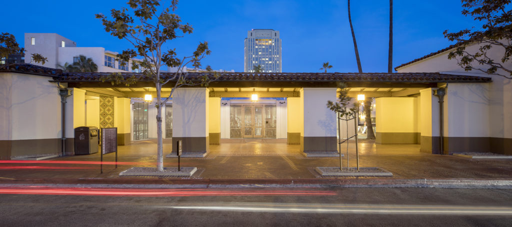
Another major challenge in designing the Los Angeles Union Station Bike Hub, was the fact that this new building needed to be “relocatable.” In the future, Metro may need to relocate the bike hub elsewhere on the site, depending on the implementation of recent master planning efforts. Therefore, we needed to design the building to be relatively easy to disassemble and reassemble, should that be necessary. The primary structure consists of steel members, bolted together. Additionally, the majority of the skin of the building consists of perforated metal panel frames that are also bolted together. Essentially, the building was designed as a kit of parts so that it could serve as a prototype for bike hubs at other stations in the future, as well as a structure that could be disassembled when and if needed.
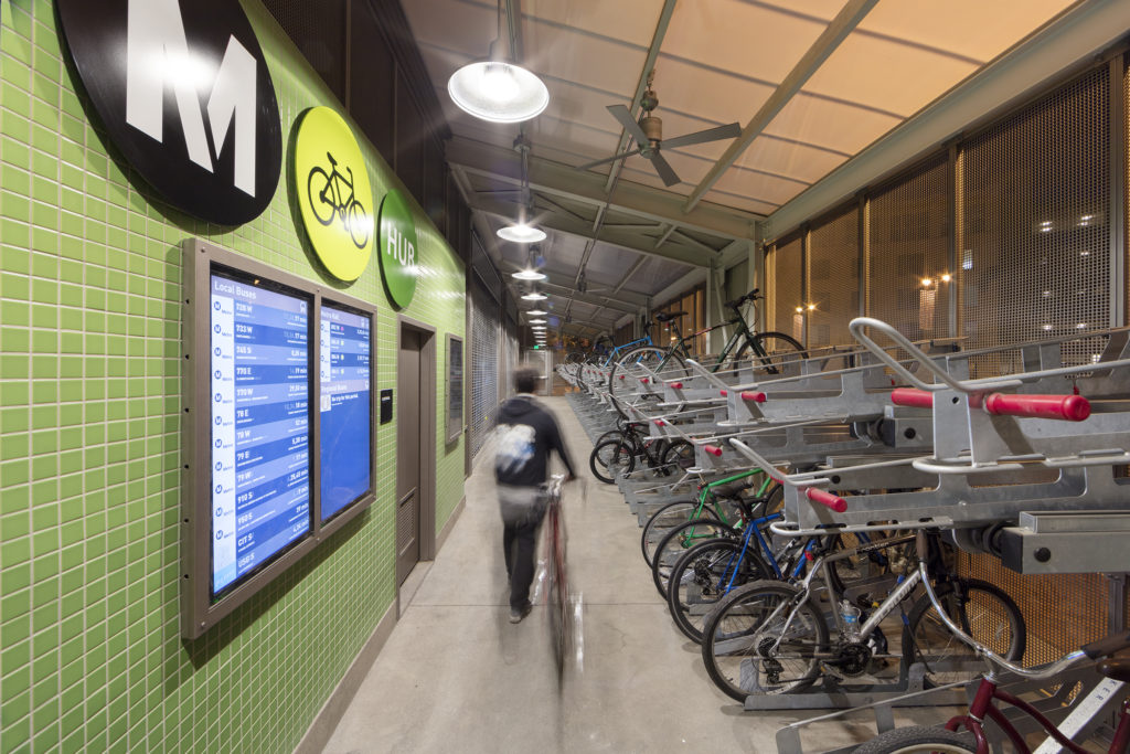
Our last major challenge in developing our design for this building was providing Metro with the branding and signage they require for their bike hubs, while also not detracting from the adjacent historic station. The branding for Metro’s bike hub consists of bright green signage and their logo. Because we decided to keep our building an open-air structure, with the majority of the skin consisting of see-through perforated metal panels, we elected to locate most of Metro’s branding and signage on the interior of the building, where it could also be seen through the perforated panels from the exterior. We clad our building core, which houses the bathroom, storage and electrical room, with tile that is the same color as Metro’s bike hub brand color, bright green. We then designed a human-scale version of their logo to be laid out in mosaic tile on the prominent entrance elevation wall. For the exterior signage, on the canopy above the main entrance, we elected to design a more traditional Metro Bike Hub sign that references the historic Union Station lettering sign found above the canopy at the main entrance to the station.
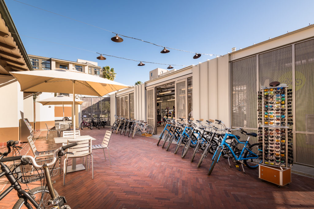
The bike hub is a modest background structure. However, as Los Angeles Union Station is one of the city’s most beloved and iconic landmarks, the design of even its ancillary facilities needs to be approached with a tremendous amount of thoughtfulness, reverence, and creativity. Our bike hub shows that good design, function, utility, and historic compatibility need not be mutually exclusive, but can work together in surprising and innovative new ways.
